


Overview In this document, you’ll discover 9 game-changing PowerPoint hacks that are essential for...
Structuring and building your slides effectively can be the difference between landing major projects and struggling to find clients. Luckily, there are eight simple steps you can take to swiftly transform your slides - without doing a lot of extra work.
Why It's Important: Making Your Slides Shine
Slides play a pivotal role in million-dollar projects. They serve multiple purposes, including:
- Breaking down complex ideas into easily understandable portions
- Providing strategic insights that guide companies over the years
- Uncovering research and insights from multiple data sources
IIn simpler terms, your communication needs to be crystal clear. By following the principles below, you'll be on solid ground.
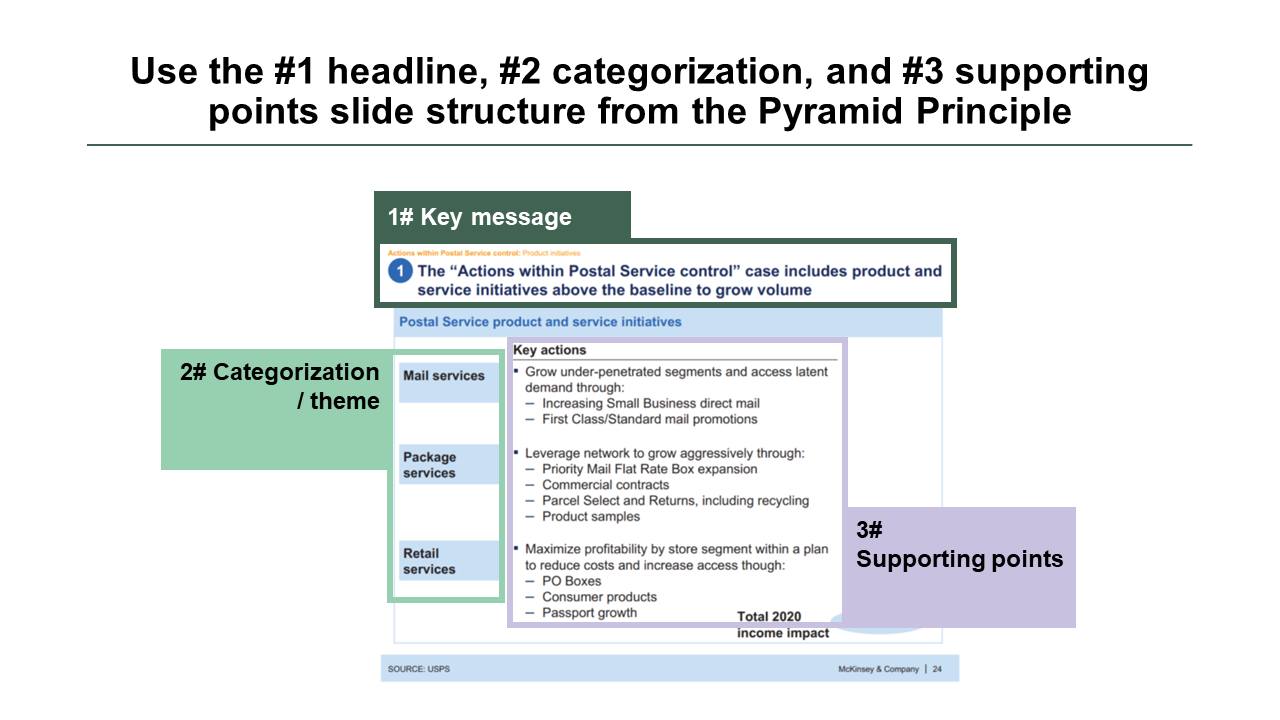
Section 1: Embrace the Pyramid Principle
The Pyramid Principle, introduced by Barbara Minto's bestselling book, is a cornerstone of the consulting world. First published in 1985 and updated several times, its central message remains just as relevant today:
- Lead with Your Headline/Key Message
- Organize and Theme Your Arguments
- Include Supporting Points
Why it matters
This framework is time-tested across generations. In addition, using this framework is a subtle way to let others know “I am in the know”.
How to do it
Usually when creating a slide, we work backwards through this structure.
- We start by conducting the analysis that forms the basis for our supporting points.
- As these supporting points take shape, we can group them into categories or themes.
- Once we have a clear picture of all the supporting points, we can use our headline to craft a compelling narrative around the slide's content.
Worth noting: It's worth mentioning that sometimes we might enter the slide creation process with a fairly solid conclusion in mind. Other times, we may need to do more groundwork before even beginning the slide.
1a: Use your headline for a key message, not as a label
The marketing guru David Ogilvy said: “When you have written your headline, you have spent 80 cents of your dollar”.
Why it matters
The headline is the most precious real estate of any slide. It is the first thing an executive sees and it should be used for storytelling. In fact, a busy executive should be able to read only the headlines in a presentation and still grasp the key conclusions.
Here’s how
Many, especially younger analysts, use labels in their headlines. But here's a better approach: let your headlines encapsulate clear conclusions and actionable steps. This sets the stage for your audience and makes your slide a breeze to read. Here are a few examples:
- Key facts about Australia -> Australia is a highly developed country in the South-Eastern hemisphere with 27 million inhabitants
- Key findings from our analysis -> Company X can minimize supply chain issues by nearshoring widget production
Remember, it all boils down to the "bottom line upfront."
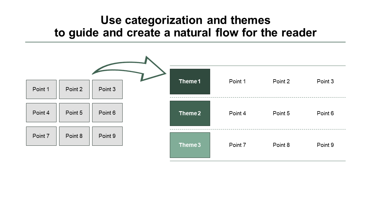
1b: Group and label items to create a natural flow
If you throw 9 supporting points on a slide without any clear categorization you are already overwhelming and losing the reader.
Throw the same 9 supporting points on a slide in groups of 3 and the flow is suddenly highly structured and the reader knows where to go next.
Why it matters
This isn't just about helping your reader; it's also a fantastic tool for you as the slide creator to emphasize what matters most. When you categorize or give themes, remember to:
- First, pick the most vital theme, then the second most crucial, and so forth.
- Second, arrange the sub-points by importance.
The bottom line: This categorization method makes slides much easier to digest and understand quickly.
1c: Create your supporting points and data
Your headlines and categories must be backed by solid evidence. This is where you showcase the data from your in-depth analysis, which, again, can be supported by appendix slides.
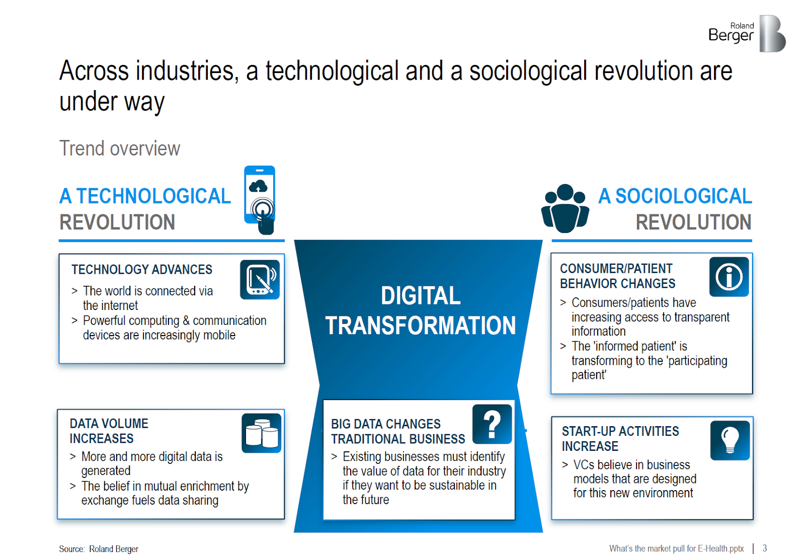
When you present facts on your slide, remember, it's another opportunity to weave a compelling story while emphasizing the most crucial points. As an example, take a look at this from Roland Berger. Pay attention to how all their supporting points contribute to the narrative introduced in the headline.
This is an executive summary slide, and I would expect the following slides to provide data for each of the points made.
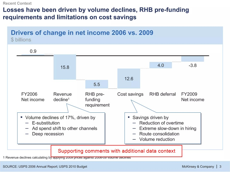
Here is a more classical example from McKinsey. Notice how they provide context with callouts to augment the supporting data, all while the headline conveys the entire story.
1d: One message per slide
In consulting decks without any punch, we often see multiple topics crammed into one slide.
Why it matters
When too many topics squeeze onto one slide, crafting a compelling headline becomes challenging. Moreover, it blurs your main message - what's truly important here?
The solution is simple: Stick to One Message per Slide.
Here’s how
Before you even start your slides, know what you are going to say. Don’t write your headline yet, but think about topics as you design your slide outline. Page 1 focuses on topic A, page 2 on topic B, and so on.
For instance, let's look at this slide from a McKinsey presentation as an example:
In this slide, the spotlight is on the expected global payments growth. The left side provides a macro-level view globally, while the right side drills into the regional breakdown of this growth.
Section 2: How to make your slide stand out visually
Now that we've tackled section 1 and mastered slide structure, let's dive into section 2, where we'll explore crucial steps to ensure your slide shines visually.
2a: Box things up
Many PowerPoint slides consist of a headline, a graph, and some boring bullet points. To make your slide stand out with the exact same content, there’s a simple solution: Box It Up. This not only makes it more interesting for the reader but also gives a more professional appearance.
Here’s how
It is pretty simple. Break up the monotony of your boring bullet slide by slicing the text into separate text boxes and placing them within dedicated boxes.
Same content, and a brand-new slide.
2b: Use images and icons
They say a picture paints a thousand words, but icons, well, they're at least a hundred words each. With images and icons, you can convey more using less.
Caution: Avoid going overboard with images and icons; use them strategically to provide additional information when it's relevant.
Let’s see some examples of good icon use
Looking at the earlier slide from Roland Berger, they augment the categorization with icons.
In the image above, the icons are used cleverly. The icon on the left highlights one of the driving forces, namely the technological advances. The icon on the right highlights the other driving force, which is the change in consumer preferences.
Another good example is from this BCG slide. While the design is dated, the icons serve as a quick guide to understanding each of the driving forces.
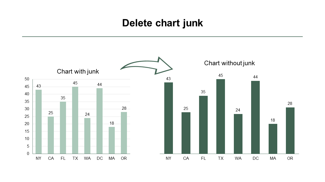
2c: Remove chart junk
As a rule of thumb, if a chart element serves no purpose, delete it. We refer to this as chart junk.
In the example below, we've eliminated the left axis and the gridlines because they're not needed. The data labels on the individual bars provide all the necessary information.
2d: Order your chart data (logically)
Take a glance at the chart above. Can it be improved? Absolutely.
In the initial chart, the data is presented in a seemingly random order. New York is followed by California, followed by Florida, and so on. In this case, it makes sense to arrange the data by size.
As shown above, we've reordered the data by size, making the chart much easier to comprehend. Typically, we sort data using one of the following parameters:
- Time: When illustrating a trend over time, we sort it by month, year, or a similar timeframe.
- Logical/Pre-determined: In scenarios like creating a waterfall chart, there's usually a natural order for presenting individual items. For example, to move from Revenue to Net Income, you start with Revenue, then factor in Variable Costs, followed by SG&A, and so on.
- Size: When there's no clear sorting logic, we often opt for size-based ordering.
If you use one of these 3 orderings, you are on safe footing.
Now there’s only one thing left!
Start implementing the tips above in your slides.
If you enjoyed this article or have any questions or comments, please let us know at support@scaledoffice.com.
And if you want more tips like this, be sure to subscribe to our newsletter.